
标签Tag
一、效果总览
二、描述
- 支持设置文本及文本上下左右图标
- 支持水平滑动和流式两种布局
- 支持自定义tags样式
- 支持onItemClick处理tag的点击回调
- 支持感应tagItems数据变化(支持感应数组本身的赋值和添加、删除、更新数组,以及数组项属性的变化)
三、构造函数及参数说明
text
OmniTag({
  tagItems: TagItemInfo[],
  selectable?: boolean,
  isSelectedBold?: boolean,
  mode?: TagMode,
  horizontalSpace?: number | string,
  flexSpace?: FlexSpaceOptions,
  style?: TagStyle,
  onItemClick?: (tagItemInfo: TagItemInfo, index: number)=>void
})

class TagItemInfo {
  title?: string
  icons?: IconInfo
  tagStyle?: TagStyle
  isSelected: boolean
}

interface IconInfo {
  top?: IconItemInfo,
  bottom?: IconItemInfo,
  left?: IconItemInfo,
  right?: IconItemInfo
}

interface IconItemInfo {
  icon?: PixelMap | ResourceStr | DrawableDescriptor
  iconSize?: SizeOptions
}

interface TagStyle {
  textMargin?: Margin | Length | LocalizedMargin
  fontSize?: string | number | Resource
  fontColor?: ResourceColor
  backgroundColor?: ResourceColor
  selectedFontSize?: string | number | Resource
  selectedBackgroundColor?: ResourceColor
  selectedFontColor?: ResourceColor
  itemBorder?: BorderOptions
  selectedItemBorder?: BorderOptions
  itemPadding?: Padding | Length | LocalizedPadding
  itemSize?: SizeOptions
}

enum TagMode {
  HORIZONTAL_SCROLL,
  FLEX
}| 参数名 | 类型 | 必填 | 说明 |
|---|---|---|---|
| tagItems | TagItemInfo[] | 是 | 展示的标签列表 |
| selectable | boolean | 否 | 是否可选中,默认可选中 |
| isSelectedBold | boolean | 否 | 选中后字体是否加粗,默认不加粗 |
| mode | TagMode | 否 | tag布局类型,默认水平滑动布局 |
| horizontalSpace | number | string | 否 | 水平滑动布局中tag的间距 |
| flexSpace | FlexSpaceOptions | 否 | 流式布局中tag的间距 |
| style | TagStyle | 否 | tag的全局样式 |
| onItemSelected | (tagItemInfo: TagItemInfo, index: number) => void | 否 | 选中回调 |
TagItemInfo
| 参数名 | 类型 | 必填 | 说明 |
|---|---|---|---|
| title | string | 否 | 标签文本 |
| icons | IconInfo | 否 | 标签中文本前后左右的icon |
| tagStyle | TagStyle | 否 | 当前tag的样式 |
| isSelected | boolean | 否 | 当前tag的选中状态 |
IconInfo
| 参数名 | 类型 | 必填 | 说明 |
|---|---|---|---|
| top | IconItemInfo | 否 | 标签内位于文本上边的图标 |
| bottom | IconItemInfo | 否 | 标签内位于文本下边的图标 |
| left | IconItemInfo | 否 | 标签内位于文本左边的图标 |
| right | IconItemInfo | 否 | 标签内位于文本右边的图标 |
IconItemInfo
| 参数名 | 类型 | 必填 | 说明 |
|---|---|---|---|
| icon | PixelMap | ResourceStr | DrawableDescriptor | 否 | 图片的数据源,支持本地图片和网络图片 |
| iconSize | SizeOptions | 否 | 图片的大小 |
TagStyle
| 参数名 | 类型 | 必填 | 说明 |
|---|---|---|---|
| textMargin | Margin | Length | LocalizedMargin | 否 | 文本的外间距 |
| fontSize | string | number | Resource | 否 | 文本的字体大小 |
| selectedFontSize | string | number | Resource | 否 | 选中文本的字体大小 |
| fontColor | ResourceColor | 否 | 文本的字体颜色 |
| selectedFontColor | ResourceColor | 否 | 选中文本的字体颜色 |
| backgroundColor | ResourceColor | 否 | tag的背景颜色 |
| selectedBackgroundColor | ResourceColor | 否 | tag选中时的背景颜色 |
| itemBorder | BorderOptions | 否 | tag的边框样式 |
| selectedItemBorder | BorderOptions | 否 | tag选中时的边框样式 |
| itemPadding | Padding| Length| LocalizedPadding | 否 | tag的内边距 |
| itemSize | SizeOptions | 否 | tag的尺寸 |
TagMode
| 参数名 | 描述 |
|---|---|
| HORIZONTAL_SCROLL | 水平滑动布局 |
| FLEX | 流式布局 |
四、代码演示
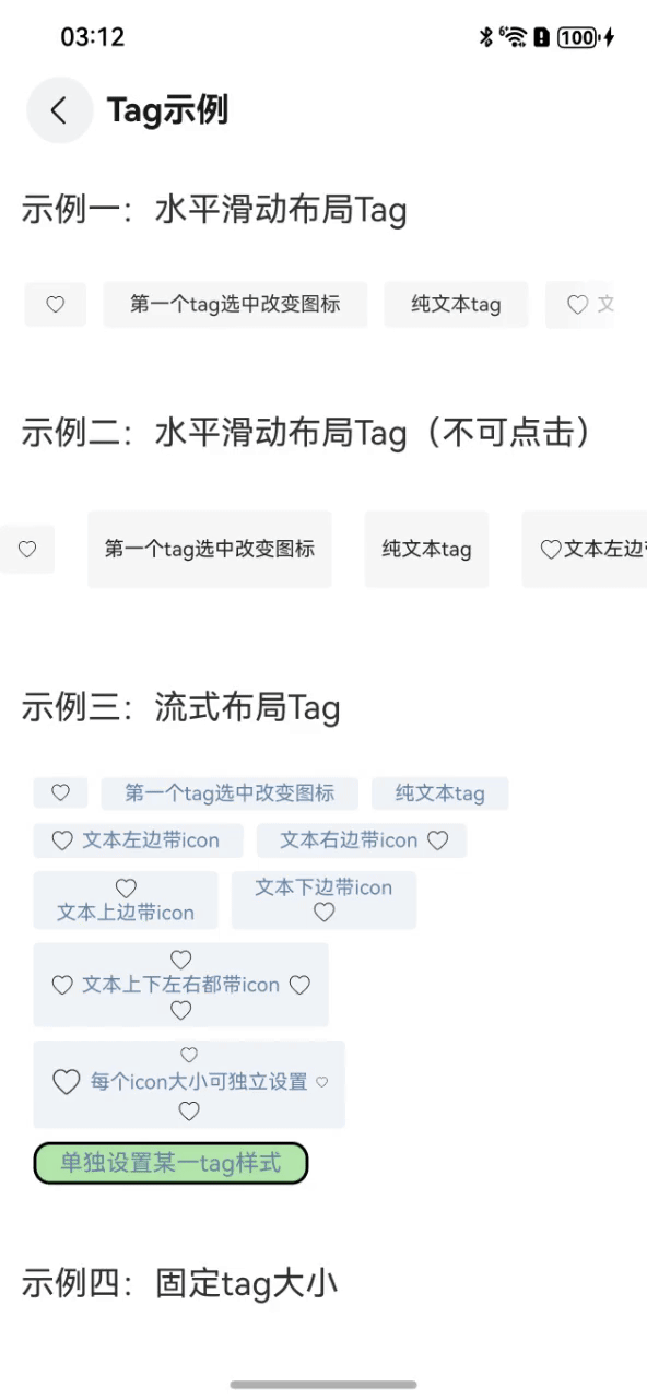
示例一:水平滑动布局Tag

text
@Entry
@Component
struct TagExample {
@State tagItems: TagItemInfo[] = [
new TagItemInfo({
icons: {
left: {
icon: $r('app.media.tag_heart'),
iconSize: { width: 13, height: 13 }
},
},
}),
new TagItemInfo({ title: '第一个tag选中改变图标' }),
new TagItemInfo({ title: '纯文本tag' }),
new TagItemInfo({
title: '文本左边带icon',
icons: {
left: { icon: $r('app.media.tag_heart') }
}
}),
new TagItemInfo({
title: '文本右边带icon',
icons: {
right: { icon: $r('app.media.tag_heart') }
}
}),
new TagItemInfo({
title: '文本上边带icon',
icons: {
top: { icon: $r('app.media.tag_heart') }
}
}),
new TagItemInfo({
title: '文本下边带icon',
icons: {
bottom: { icon: $r('app.media.tag_heart') }
}
}),
new TagItemInfo({
title: '文本上下左右都带icon',
icons: {
left: { icon: $r('app.media.tag_heart') },
right: { icon: $r('app.media.tag_heart') },
top: { icon: $r('app.media.tag_heart') },
bottom: { icon: $r('app.media.tag_heart') },
}
}),
new TagItemInfo({
title: '每个icon大小可独立设置',
icons: {
left: { icon: $r('app.media.tag_heart'), iconSize: { width: 20, height: 20 } },
right: { icon: $r('app.media.tag_heart'), iconSize: { width: 8, height: 8 } },
top: { icon: $r('app.media.tag_heart'), iconSize: { width: 12, height: 12 } },
bottom: { icon: $r('app.media.tag_heart') },
}
}),
new TagItemInfo({
title: '单独设置某一tag样式',
tagStyle: {
backgroundColor: 0xb4e7ad,
selectedBackgroundColor: 0x33ff552e,
fontSize: 14,
itemBorder: { width: 2, color: Color.Black, radius: 10 }
},
})]
build() {
Column() {
Stack() {
OmniTag({
tagItems: this.tagItems,
horizontalSpace: 10,
style: {
itemPadding: {
left: 12,
right: 12,
top: 7,
bottom: 7
},
backgroundColor: 0xF8F8F8,
selectedBackgroundColor: 0xFFEFEB,
itemBorder: { radius: 3 },
fontColor: 0x333333,
selectedFontColor: 0xff552e,
fontSize: 12
},
onItemClick: (item: TagItemInfo, index: number) => {
if (index == 0) {
let isSelected = item.isSelected
item.icons = {
left: {
icon: isSelected ? $r('app.media.tag_heart_fill') : $r('app.media.tag_heart'),
iconSize: { width: 13, height: 13 }
},
}
}
}
}).margin({ left: 15 })
.padding({ right: 20 })
Rect({ width: 50, height: 50 })
.fill(Color.Transparent)
.enabled(false)
.linearGradient({
direction: GradientDirection.Left,
colors: [['rgba(255, 255, 255, 1.0)', 0.0], ['rgba(255, 255, 255, 0.5)', 0.7],
['rgba(255, 255, 255, 0.0)', 1.0]],
repeating: false
})
}.alignContent(Alignment.End)
}
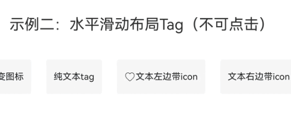
}示例二:水平滑动布局Tag-不可点击
text
@Entry
@Component
struct TagExample {
@State tagItems: TagItemInfo[] = [
new TagItemInfo({
icons: {
left: {
icon: $r('app.media.tag_heart'),
iconSize: { width: 13, height: 13 }
},
},
}),
new TagItemInfo({ title: '第一个tag选中改变图标' }),
new TagItemInfo({ title: '纯文本tag' }),
new TagItemInfo({
title: '文本左边带icon',
icons: {
left: { icon: $r('app.media.tag_heart') }
}
}),
new TagItemInfo({
title: '文本右边带icon',
icons: {
right: { icon: $r('app.media.tag_heart') }
}
}),
new TagItemInfo({
title: '文本上边带icon',
icons: {
top: { icon: $r('app.media.tag_heart') }
}
}),
new TagItemInfo({
title: '文本下边带icon',
icons: {
bottom: { icon: $r('app.media.tag_heart') }
}
}),
new TagItemInfo({
title: '文本上下左右都带icon',
icons: {
left: { icon: $r('app.media.tag_heart') },
right: { icon: $r('app.media.tag_heart') },
top: { icon: $r('app.media.tag_heart') },
bottom: { icon: $r('app.media.tag_heart') },
}
}),
new TagItemInfo({
title: '每个icon大小可独立设置',
icons: {
left: { icon: $r('app.media.tag_heart'), iconSize: { width: 20, height: 20 } },
right: { icon: $r('app.media.tag_heart'), iconSize: { width: 8, height: 8 } },
top: { icon: $r('app.media.tag_heart'), iconSize: { width: 12, height: 12 } },
bottom: { icon: $r('app.media.tag_heart') },
}
}),
new TagItemInfo({
title: '单独设置某一tag样式',
tagStyle: {
backgroundColor: 0xb4e7ad,
selectedBackgroundColor: 0x33ff552e,
fontSize: 14,
itemBorder: { width: 2, color: Color.Black, radius: 10 }
},
})]
build() {
Column() {
OmniTag({
tagItems: this.tagItems,
selectable: false,
style: {
fontSize: 12,
textMargin: { top: 8, bottom: 8 },
backgroundColor: 0xF8F8F8,
fontColor: 0x1F2326,
itemPadding: {
left: 10,
right: 10,
top: 8,
bottom: 8
}
}
})
.margin({
top: 15,
bottom: 20,
})
}
.justifyContent(FlexAlign.Center)
}
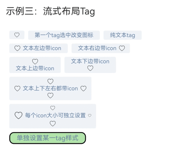
}示例三:流式布局Tag
text
@Entry
@Component
struct TagExample {
@State tagItems: TagItemInfo[] = [
new TagItemInfo({
icons: {
left: {
icon: $r('app.media.tag_heart'),
iconSize: { width: 13, height: 13 }
},
},
}),
new TagItemInfo({ title: '第一个tag选中改变图标' }),
new TagItemInfo({ title: '纯文本tag' }),
new TagItemInfo({
title: '文本左边带icon',
icons: {
left: { icon: $r('app.media.tag_heart') }
}
}),
new TagItemInfo({
title: '文本右边带icon',
icons: {
right: { icon: $r('app.media.tag_heart') }
}
}),
new TagItemInfo({
title: '文本上边带icon',
icons: {
top: { icon: $r('app.media.tag_heart') }
}
}),
new TagItemInfo({
title: '文本下边带icon',
icons: {
bottom: { icon: $r('app.media.tag_heart') }
}
}),
new TagItemInfo({
title: '文本上下左右都带icon',
icons: {
left: { icon: $r('app.media.tag_heart') },
right: { icon: $r('app.media.tag_heart') },
top: { icon: $r('app.media.tag_heart') },
bottom: { icon: $r('app.media.tag_heart') },
}
}),
new TagItemInfo({
title: '每个icon大小可独立设置',
icons: {
left: { icon: $r('app.media.tag_heart'), iconSize: { width: 20, height: 20 } },
right: { icon: $r('app.media.tag_heart'), iconSize: { width: 8, height: 8 } },
top: { icon: $r('app.media.tag_heart'), iconSize: { width: 12, height: 12 } },
bottom: { icon: $r('app.media.tag_heart') },
}
}),
new TagItemInfo({
title: '单独设置某一tag样式',
tagStyle: {
backgroundColor: 0xb4e7ad,
selectedBackgroundColor: 0x33ff552e,
fontSize: 14,
itemBorder: { width: 2, color: Color.Black, radius: 10 }
},
})]
build() {
Column() {
OmniTag({
tagItems: this.tagItems,
mode: TagMode.FLEX,
style: {
fontSize: 12,
fontColor: 0x6884A5,
textMargin: { left: 4, right: 4 },
backgroundColor: 0x249DB8D7,
itemBorder: { radius: 3 },
itemPadding: {
left: 10,
right: 10,
top: 3,
bottom: 3
},
},
flexSpace: { main: LengthMetrics.vp(8), cross: LengthMetrics.vp(8) }
})
.margin({
left: 20,
top: 10,
right: 13,
bottom: 8
})
}
}
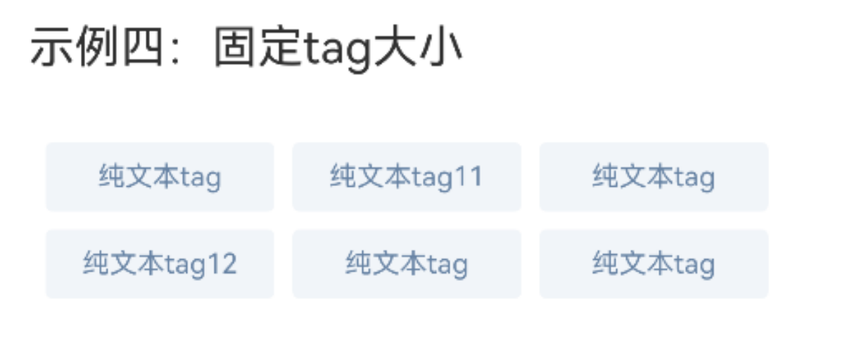
}示例四:流式布局Tag-固定Tag大小
text
@Entry
@Component
struct TagExample {
  @State tagItems: TagItemInfo[] = [
    new TagItemInfo({ title: '纯文本tag' }),
    new TagItemInfo({ title: '纯文本tag11' }),
    new TagItemInfo({ title: '纯文本tag' }),
    new TagItemInfo({ title: '纯文本tag12' }),
    new TagItemInfo({ title: '纯文本tag' }),
    new TagItemInfo({ title: '纯文本tag' }),
  ]

  build() {
    Column() {
      OmniTag({
            tagItems: this.tagItems,
            mode: TagMode.FLEX,
            style: {
              fontSize: 12,
              fontColor: 0x6884A5,
              backgroundColor: 0x249DB8D7,
              itemBorder: { radius: 3 },
              itemPadding: {
                left: 10,
                right: 10,
                top: 3,
                bottom: 3
              },
              itemSize: { width: 100, height: 30 }
            },
            flexSpace: { main: LengthMetrics.vp(8), cross: LengthMetrics.vp(8) }
          })
            .margin({
              left: 20,
              top: 10,
              right: 13,
              bottom: 8
            })
    }
  }
}