
吐司Toast
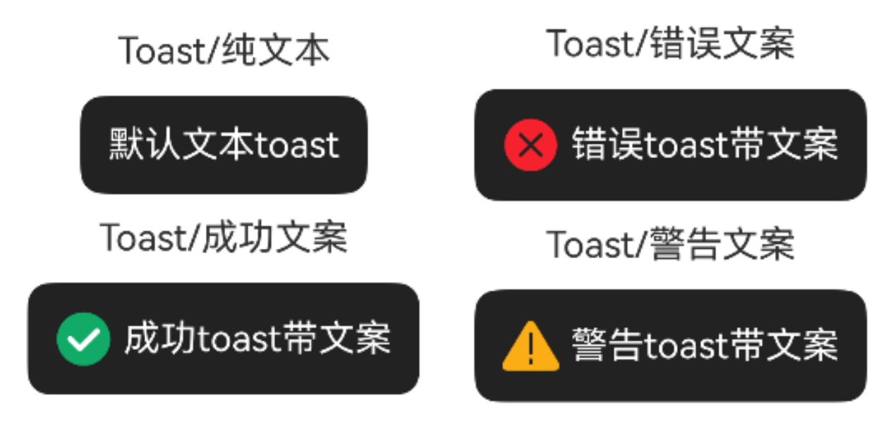
一、效果总览
二、描述
- 功能齐全的toast文本提示框
- 支持文字前面加icon,内置三种icon,可自定义
- 支持通过theme定制toast的样式
- 📢注意:使用前需先调用
OmniToast.initToast(uiContext: UIContext)初始化toast
三、构造函数及参数说明
text
// 入参不可为空
public static showText(options: ToastOptions)

// 入参可为空,入参为空时仅显示成功图标
public static showSuccess(options?: ToastOptions)

// 入参可为空,入参为空时仅显示错误图标
public static showError(options?: ToastOptions)

// 入参可为空,入参为空时仅显示警告图标
public static showWarning(options?: ToastOptions)
ToastOptions
| 参数名 | 类型 | 必填 | 说明 |
|---|---|---|---|
| msg | string | 否 | toast文本 |
| duration | number | 否 | toast展示时间,默认值2500ms |
| icon | PixelMap | ResourceStr | DrawableDescriptor | ImageContent | 否 | toast文本前的图标 |
| alignment | DialogAlignment | 否 | toast与屏幕的对齐方式,默认值DialogAlignment.Default |
| offset | Offset | 否 | 在对齐方式上的偏移 |
| onDismiss | (() => void) | 否 | toast消失回调 |
| theme | ToastTheme | 否 | toast主题样式 |
ToastTheme
| 参数名 | 类型 | 必填 | 说明 |
|---|---|---|---|
| textColor | ResourceColor | 否 | 文本颜色,默认值Color.White |
| fontSize | number | string | Resource | 否 | 文本大小,默认值16 |
| backgroundColor | ResourceColor | 否 | 背景颜色,默认值0xDD000000 |
| borderRadius | Dimension | BorderRadius | 否 | 边框圆角,默认值10 |
| borderWidth | Dimension | EdgeWidths | 否 | 边框宽度 |
| borderColor | ResourceColor | EdgeColors | 否 | 边框颜色 |
| borderStyle | BorderStyle | EdgeStyles | 否 | 边框样式 |
| backgroundBlurStyle | BlurStyle | 否 | 背板模糊材质 |
| shadow | ShadowOptions | ShadowStyle | 否 | 背板阴影 |
| width | Dimension | 否 | toast的宽度 |
| height | Dimension | 否 | toast的高度 |
| iconWidth | Dimension | 否 | icon的宽度 |
| iconHeight | Dimension | 否 | icon的高度 |
四、代码演示
示例一:默认文本toast
text
@Entry
@Component
struct ToastExample {
  build() {
    Column() {
      Button('默认文本toast').onClick(() => {
        Toast.showText({
          msg: "默认文本toast"
        })
      })
    }
  }
}
示例二:成功文案toast
text
@Entry
@Component
struct ToastExample {
  build() {
    Column() {
      Button('成功文案toast').onClick(() => {
        Toast.showSuccess({msg: '成功文案toast'})
      })
    }
  }
}
示例三:错误文案toast
text
@Entry
@Component
struct ToastExample {
  build() {
    Column() {
      Button('错误文案toast').onClick(() => {
        Toast.showError({msg: '错误文案toast'})
      })
    }
  }
}
示例四:警告文案toast
text
@Entry
@Component
struct ToastExample {
  build() {
    Column() {
      Button('警告文案toast').onClick(() => {
        Toast.showWarning({msg: '警告文案toast'})
      })
    }
  }
}
示例五:自定义toast
text
@Entry
@Component
struct ToastExample {
  @State text: string = 'theme属性自定义toast样式'
  build() {
    Column() {
      Button(this.text).onClick(() => {
        Toast.showText({
          msg: 'theme属性自定义toast样式',
          theme: {
            textColor: 0x333333,
            fontSize: 20,
            backgroundColor: 0xF7F8FB,
            borderRadius: 40,
            borderWidth: 10,
            borderColor: 0xFF500B,
            borderStyle: BorderStyle.Dotted,
            backgroundBlurStyle: BlurStyle.NONE,
            shadow: ShadowStyle.OUTER_FLOATING_MD,
            width: 300,
            height: 100,
            iconWidth: 50,
            iconHeight: 50,
          },
          duration: 1000,
          alignment: DialogAlignment.Bottom,
          offset: { dx: 0, dy: -50 }
          onDismiss: () => {
            this.text = 'toast消失后改变button文字'
          }
        })
      })
    }
  }
}